The feedback was clear, and so we’ve developed design options for multi-faceted facades.
A couple of months ago, we shared four massing schemes exploring possibilities for the building’s Size and Style. Overall, the feedback we received preferred designs that divide the facade into distinct elements rather than remaining one cohesive mass. According to our readers, schemes involving multiple varying styles helped break up the scale of the building and connect to the residential nature of the neighborhood.
This feedback resonated with our own reading of the designs, so we developed three new options that further explore this direction. Each design breaks down the facade into distinct pieces, but they vary in their rooflines, proportions, and level of contrast. We included new features such as windows, balconies, and stylization to accompany the overall scale and mass. Our goal was to develop each concept with a greater degree of specificity in order to study how the building’s details will affect the experience of the larger structure.
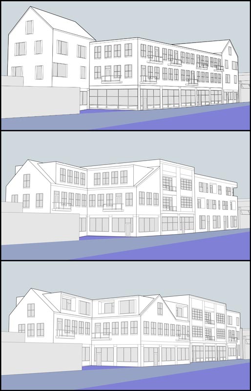
Here are views of the three options looking NW:

–
1. Iconic Gables
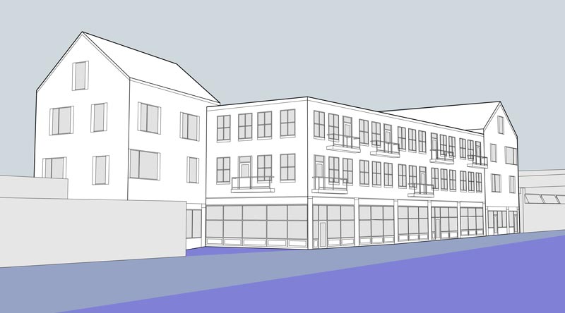
Two gable roofs anchor the building mass on either end, creating a distinctive roofline. Commenters responded to the way these roof elements relate to the residential character of the neighborhood. Here we play with contemporary style windows in the gable sections contrasting with a regular, more traditional window arrangement in the middle section (including balconies). The ground floor has storefront windows along the whole building.

–
2. Southside Dormers
In this scheme we slope the rooflines around the south-side patio, using dormers for the top-floor windows. This creates an intimate feel for this outdoor space. Along the street front, the building is broken up into three distinct masses of different heights. Each facade section has its own style of windows, ranging from traditional to contemporary. Here we also test smaller window openings in a section of the ground floor, as opposed to the fully-glass storefront style of Option 1.

–
3. Urban Collage
This is the most playful of the three schemes. Here we use the same dormers around the patio, but continue this roofline as a gable front on the street facade. This dynamic roofline then moves horizontally and is broken by a large, central building mass. On the north side of this central element, the roofline shows up again as part of a contemporary-style massing composition. Three different window types are used to distinguish the three conceptual layers of the facade.

Which of these concepts strikes the right balance between differentiation and cohesion?
What is the most resonant for Westcott Street?
As always, let us know your thoughts!
–
Share your thoughts in the comment form below:
READ MORE POSTS


Recent Comments