What happened in the study phase of this project and what was learned?
As some of you may know about and possibly participated in, we carried out an exploratory phase of this project to study its viability in 2018-19. During that initial six-month phase, we worked with City officials, the community, the property owner and financial lenders to understand the architectural, financial and social possibilities of a mixed-use building on the site. Because this type of smart-growth development aligns with the city’s planning priorities, we received positive support for it with city officials. We also received a lot of enthusiastic support from community members who are excited about creating a more pedestrian-oriented Westcott, with a greater mix of businesses and housing. The project also had critics concerned about parking problems, the size of the building, saturation of the rental market and change in general.
Here is a brief outline of the building proposal we developed during the study phase, some things learned through that study, and what changes we plan as a result:
During the study phase we had only two months to generate a design to share with the city and the community for feedback. We set out with a number of goals:
- to design for the most effective, urban use possible;
- to provide maximum storefront for businesses along the sidewalk;
- to scale the building for a neighborhood business district, while still pushing to achieve good urban density;
- and to have balconies and decks creating vertical layers of outdoor spaces across the surface of the building.
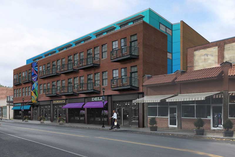
The building we proposed was three-stories at the sidewalk, with a fourth floor that was set back from both the front and back of the building. The street facade had all windows and entrances on the ground floor, with two stories of traditional brickwork with steel balconies above this storefront. Above the main entrance the brick was broken by a two-story public art element. This art piece wasn’t designed, but provided a vertical anchor for the entrance and mediated the scale of the brickwork along the street. The setback fourth story included roof decks, had a colorful panelized surface, and was intended to provide a bright contrast to the brickwork as a signal of the modernity of the project. An outdoor patio was located at the south end of the building and was the full depth of the lot. This narrow patio space doubled as a service entrance to a service hall at the back of the ground floor.
Things we learned and resulting changes planned:
1. PARKING
Parking doesn’t make sense on the lot. Despite numerous attempts to make room for parking, we concluded that including it would adversely impact the goals and viability of the project. These attempts included designs for: half the lot with parking and the other half building, parking in the rear of the building, and underground parking (testing both access from Westcott and Beech streets). In all parking scenarios, the project goal of transforming the current parking lot into space for business along the sidewalk was critically compromised. Because of the shallow footprint of the property, the gain was only six-to-twelve parking spots. Through our attempts to actualize it, it became clear that parking shouldn’t be accommodated on this site.
2. BUILDING HEIGHT
Four-stories is too tall for a new building given the existing street-scape. In our study of other thriving small neighborhood centers, we found many examples of four-story buildings working well as part of the fabric of the streetscape, and we were confident that with the fourth-floor setback this building could also work. However, when the historic mixed-use buildings in the district were replaced over the last century the new buildings were at most two stories tall. Some of the buildings were not rebuilt but instead became parking lots, as is the case on this lot. The result: instead of the traditional main street with an increased density, Westcott’s core is less dense than the surrounding residential streets. Therefore, a four-story building could out-size the existing street conditions. This was a clear and understandable concern for some of the neighbors who gave feedback on our proposal. Although we aim for this project to model a density at the neighborhood core, we also want to provide architecture that fits into what exists. This means maxing out the bulk of the building at three-stories.
3. COMMERCIAL & RESIDENTIAL MIX
The demand and desire for business space is greater than anticipated. Our initial design consisted of 30% commercial and 70% residential since we had limited business uses to the ground floor. Since our plans became public, we have been approached by multiple established business owners about their desire for quality leasable space on Westcott street. Not all of these business uses require storefront space. There’s been a corresponding excitement from neighbors for more services and opportunities to do business within the community. Because of this feedback, we plan to add commercial space to the second floor, targeting a 50%-50% mix of commercial to residential space. Since business and residential users have inverse patterns of occupancy, day-to-night, this mix will also balance the demands on street parking over the 24hr rhythms of use.
4. ZONING
Current zoning law is unsupportive of smart growth, but ReZone Syracuse will change that. We will address the challenges of the current zoning law and the positive changes that are being implemented in the ReZone in another blog post. However, it’s important to mention here that the primary challenge to designing a pedestrian-friendly, main-street style building for this site was the antiquated zoning code. This code, made into law in 1960, prescribes suburban development for the city. The new zoning aims to support healthy urban development as we now understand it after half a century of deteriorating the city fabric. We hope this change in zoning happens soon, and that we can design in concert with the law and not in conflict with it.
READ MORE POSTS


Recent Comments